This project focused on redesigning a therapist’s website to improve clarity, user flow, and brand positioning – within the constraints of a limited budget. The original site lacked clear calls to action, making it difficult for visitors to understand what steps to take next. Additionally, it didn’t effectively communicate the therapist’s unique approach or differentiate her from others in the field.
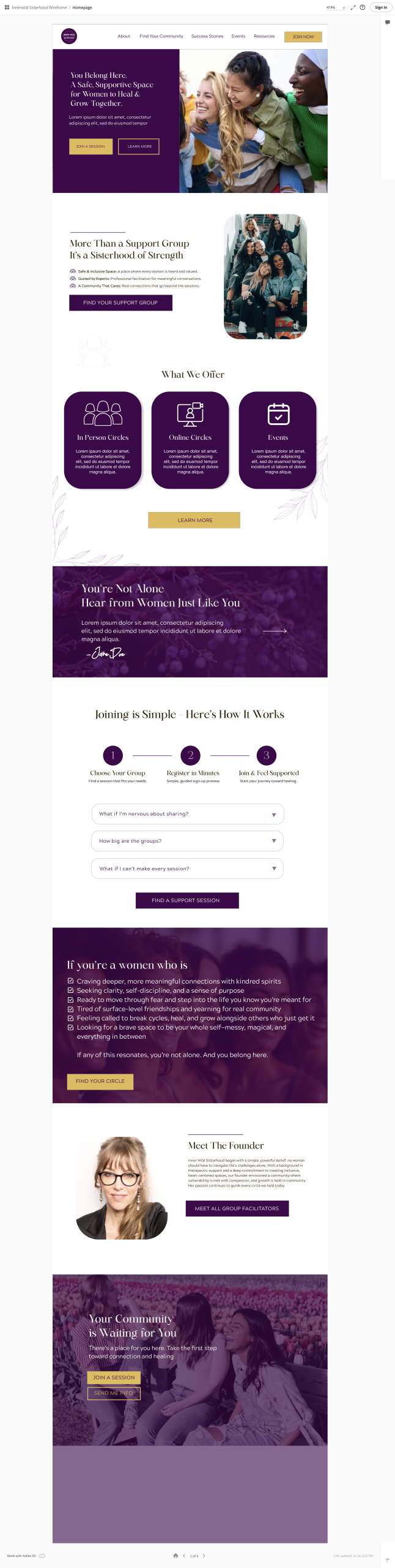
With no room in the budget for user testing or low-fidelity prototyping, we focused on streamlining the user experience through intuitive design choices and refining the messaging to better reflect her story and services. The goal was to create a more engaging, approachable site that guided users to take action – whether booking a session or learning more about her therapeutic style – while still feeling calm, safe, and supportive.
The Problem
The original website lacked:
Clear calls to action, making it unclear how users should engage
A compelling brand story to build connection and trust
Differentiation from other therapists in a saturated market
Strategic guidance toward bookings or inquiries
As a result, the site didn’t reflect the therapist’s unique approach or help potential clients confidently take the next step.
Project Goals
Clarify the user journey by incorporating strategic calls to action that guide visitors toward booking or reaching out
Establish a stronger brand presence by weaving in the therapist’s story, tone, and values throughout the site
Differentiate the therapist’s approach from others in the industry by highlighting her unique methods, experience, or philosophy
Encourage new members through stronger CTAs and design structure
Target Audience
Target Segment: The Anxious Seeker
Name: Emily Age: 29 Location: Vancouver, BC Household Income: $60K/year Education: Bachelor’s Degree in Social Sciences Family Status: Single, no children
Emily works in the non-profit sector and has always carried a deep sense of empathy, but lately she’s been feeling overwhelmed and isolated. She’s tried one-on-one therapy in the past but is now seeking something more community-focused. As a woman navigating anxiety and burnout, she wants to feel safe, understood, and less alone. With a busy schedule, accessibility and ease are essential-she’s open to in-person but prefers online support options.
Pain Points & Challenges:
Feels emotionally drained and unsupported in her current routines
Unsure what group therapy actually looks like or if she’ll fit in
Feels awkward reaching out without knowing what to expect
Doesn’t feel a connection from most therapy websites she’s visited
Has seen too many clinical or cold-feeling designs that intimidate her
Needs
A clear explanation of how the group sessions work and who they’re for
Reassurance that this is a safe, inclusive space for women
A calm, welcoming tone and modern visuals that reflect emotional safety
Simple steps to join or inquire – without feeling pressured
Mobile-friendly design, since she researches on-the-go
Target Segment: The Burnout Survivor
Name: Carla Age: 43 Location: Rural Alberta Household Income: $90K/year (combined) Education: Teaching Degree Family Status: Married with two teenagers
Carla has been teaching for over 15 years and is proud of her work—but the last few years have left her depleted. She’s never done therapy before, but she’s reached a point where she knows she needs support. She’s not ready for intense one-on-one sessions, but the idea of a small, supportive group of women feels manageable. Being in a rural area, online access is a must.
Pain Points & Challenges:
Feels unsure if she belongs in therapy or what it involves
Has limited time and emotional energy to “figure things out”
Worries about opening up in a group of strangers
Frustrated by confusing or overly wordy websites
Prefers to read stories or reviews before trusting a service
Needs
A warm, clear message that group therapy is for women like her
Easy-to-understand descriptions of each group offering
Testimonials or stories from past participants
A gentle, non-clinical tone that makes her feel at ease
Clear info on online access, times, and how to sign up
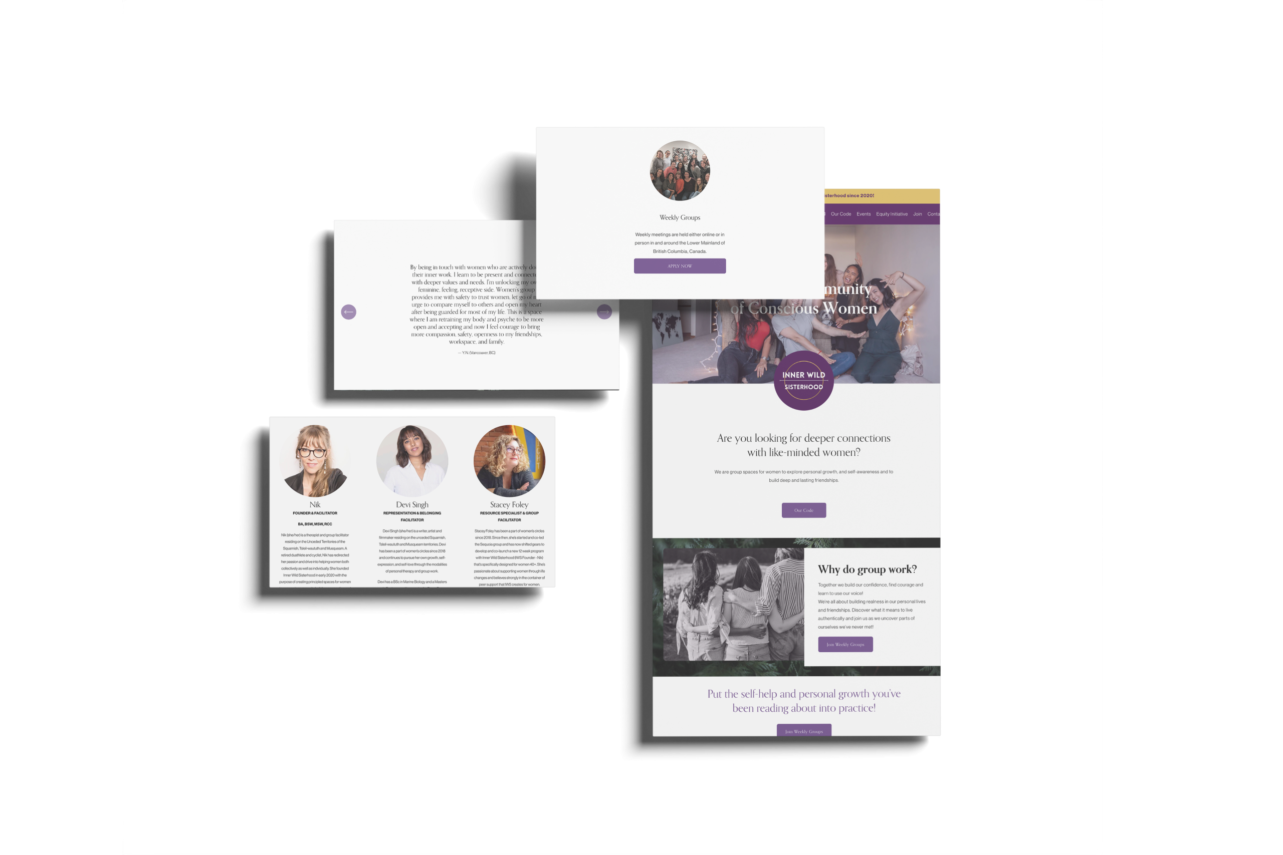
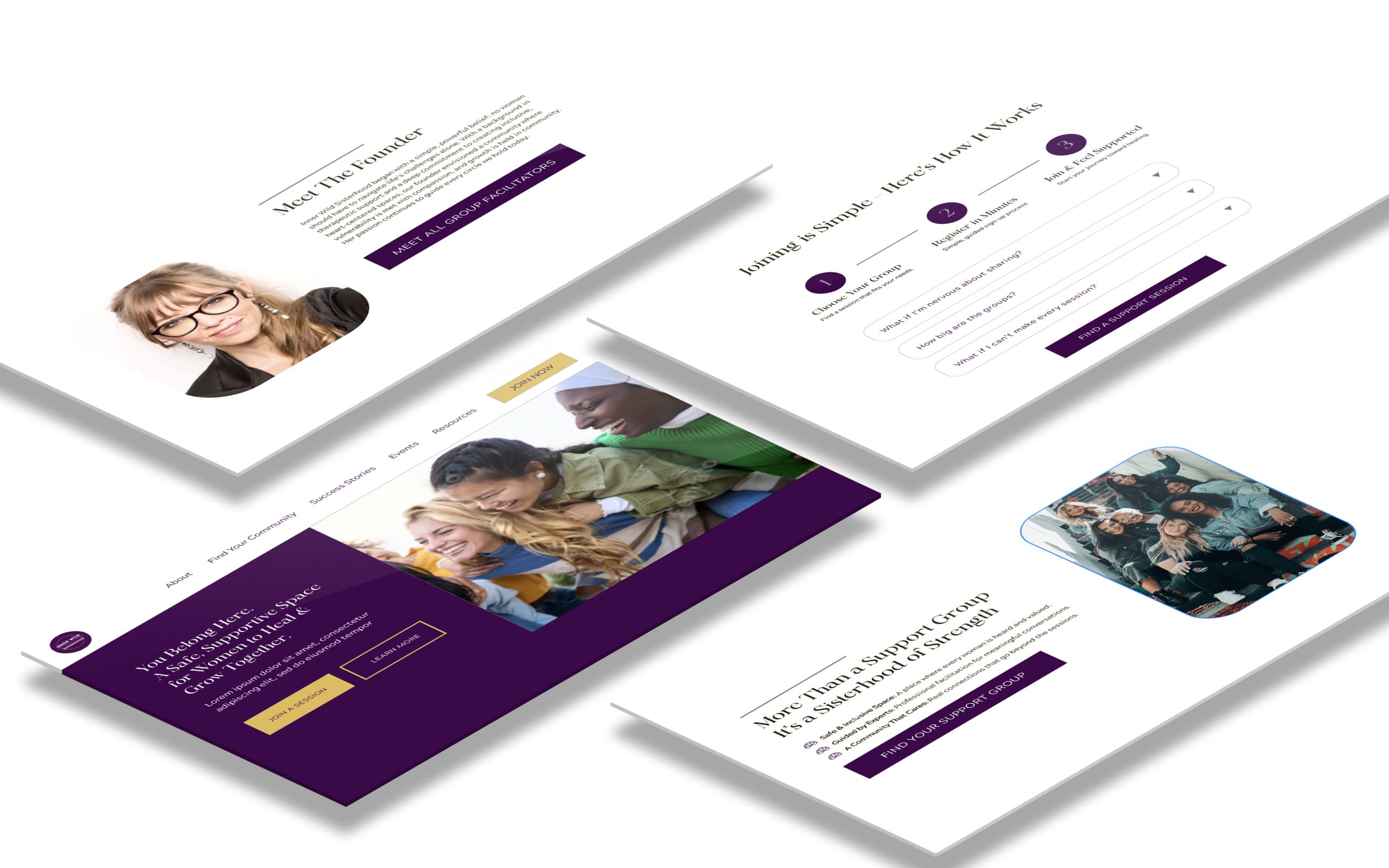
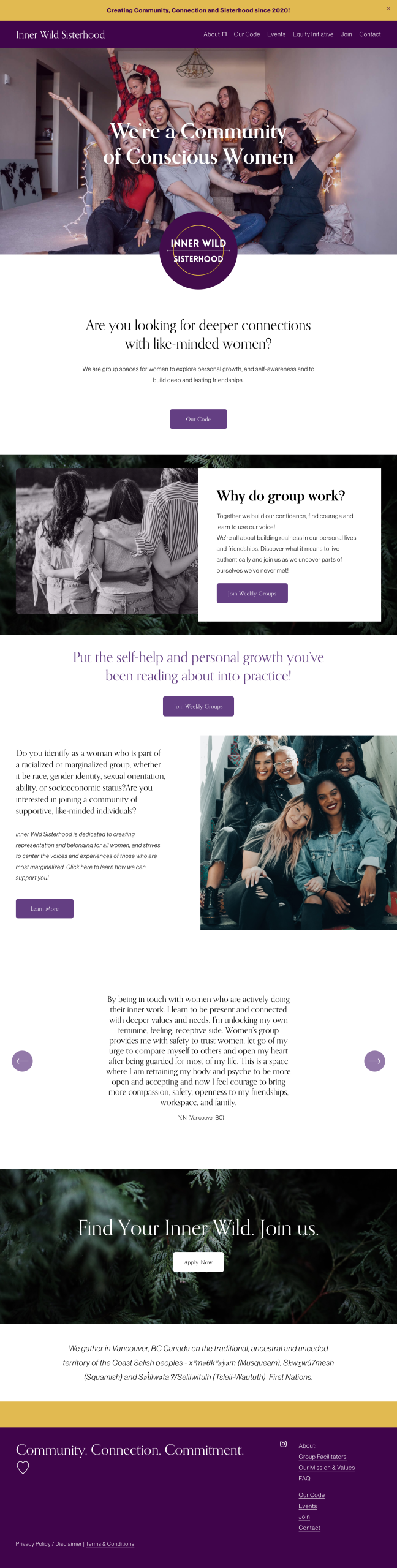
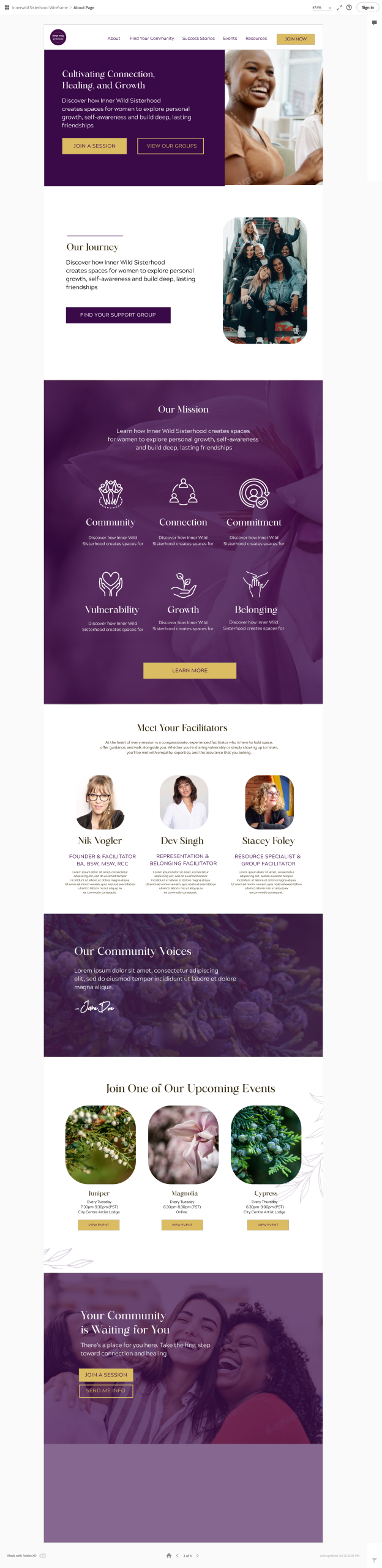
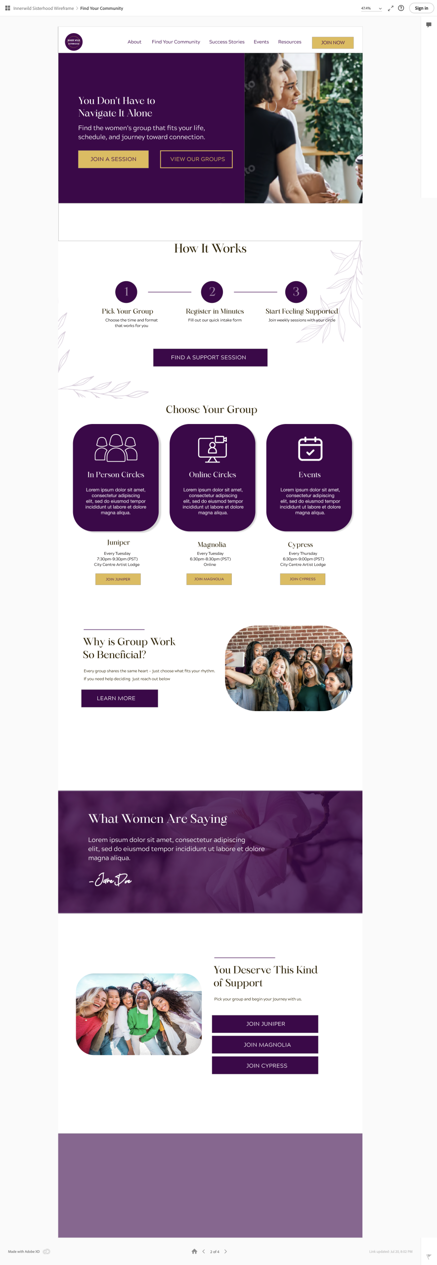
High Fidelity Designs
I brought the vision to life by:
Using calming, inclusive imagery and full-bleed sections to create emotional connection
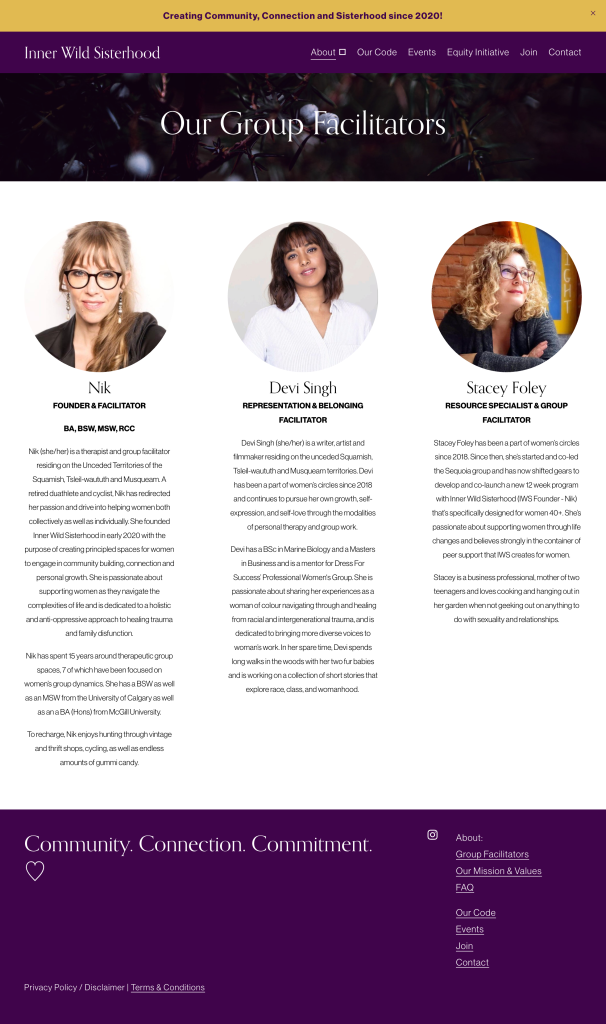
Designing clear, digestible sections that highlight her unique group offerings and therapeutic approach
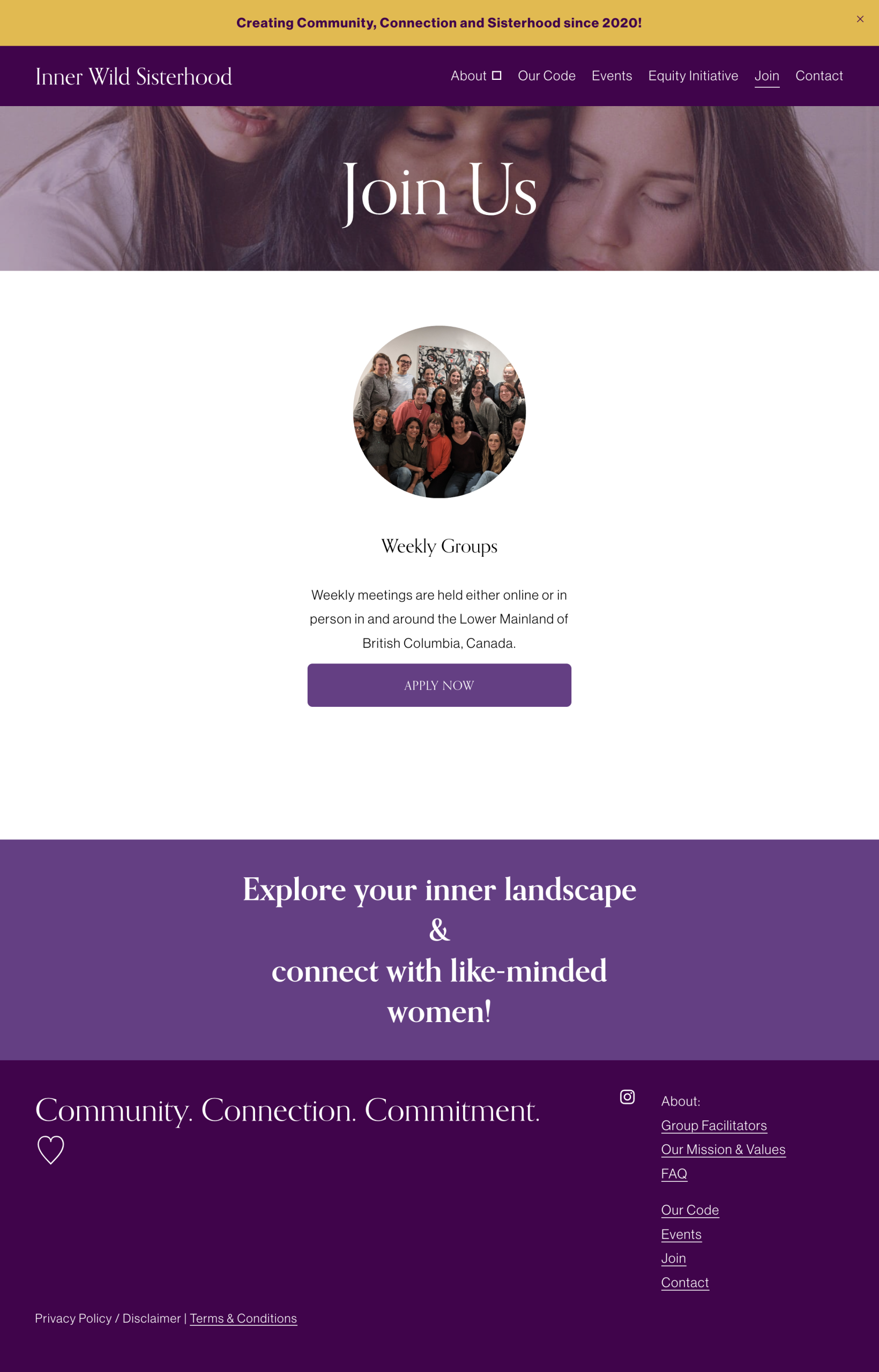
Simplifying the language and placing intentional emphasis on “Join a Session” CTAs to guide user action
Due to budget constraints, we weren’t able to conduct formal user testing for this project. However, informal feedback from the client and early users provided valuable insights.
The client expressed that the redesigned site finally “felt like her” – it reflected the warmth, clarity, and purpose behind her practice. She appreciated the simplified layout and how easy it was for visitors to understand her offerings and next steps. Several group participants also commented on how welcoming and intuitive the site felt compared to the original version.
Reflecting on the process, this project reinforced how even small design decisions – like clearer CTAs, a well-placed testimonial, or a softer visual tone – can make a significant impact on user experience. While limited by time and budget, focusing on clarity, story, and emotional resonance helped transform the site into a tool that not only informs, but connects.